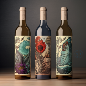
The wine industry, renowned for its dedication to tradition and quality, also tells a story of innovation and creativity through the evolution of wine bottle design and label art. At Wiens Family Cellars, nestled in the heart of Temecula Valley, we understand that a bottle of wine is much more than just its contents. It’s a statement of Quality, Family, and Integrity – principles that guide every step of our winemaking process. As we explore the journey of wine packaging, we invite you to appreciate the artistry that encases our award-winning wines, from bold reds to crisp whites, crafted for enthusiasts and novices alike.
The design of a wine bottle and its label is an intricate ballet of art and science, history, and innovation. It serves not only as a container for the wine but as a canvas that communicates the essence of the brand and the quality of the product within. This blog post delves into the historical evolution of wine bottle design and label art, highlighting their significance in the wine industry.
A Toast to the Oldies: From Clay to Glass
Remember the days when everything was simple and straightforward? Well, wine storage had its own old-school charm too. Back in the day, our wine ancestors were chilling in clay amphorae and cozying up in wooden barrels. Practical? Absolutely. Great for a quick grab-and-go at the market? Not so much. Then came the 17th century, and boy, did things get a glow-up! Glass bottles entered the scene, and it was like the wine world had discovered the fountain of youth. Suddenly, wine could age gracefully, develop those complex flavors we love, and travel far and wide. Imagine the leap from a bulky barrel to a sleek glass bottle you could actually take home. Revolutionary, right?
The Fashion Evolution of Wine Bottles
Fast forward through time, and wine bottles started to strut their stuff, showing off different shapes and sizes like they were walking down the Paris fashion week runway. We got the Bordeaux, the Burgundy, and the Champagne bottles, each with its own signature look. But it’s not just about good looks; these shapes are like the secret agents of the wine world, each with a mission. The Bordeaux bottles with their broad shoulders are all about keeping those sediments in check for the bold reds. The Burgundy bottles? They’re the elegant ones, with a gently sloping shoulder, perfect for the sophisticated Pinots and Chardonnays. And then there’s the Champagne bottle, robust and ready to handle the pressure of those celebratory bubbles.
It’s like each bottle was designed with a purpose, telling the story of the wine inside before you even take a sip. It’s a beautiful blend of function and flair, where the bottle not only protects and preserves the wine but also whispers hints about its origin and style. And let’s be honest, who doesn’t judge a wine by its bottle every now and then? Take a peek at this cool article on the evolution of wine bottle shapes.
Spilling the Secrets Behind Wine Label Art
From Classic to Cutting-Edge: The Label Glow-Up
So, picture this: you’re wandering through aisles of wine, and there’s this label that catches your eye. It’s not just any label—it’s like a mini masterpiece wrapped around a bottle. This isn’t just by chance. Wine labels have had their own kind of renaissance, evolving from the straight-laced, “just-the-facts” style to becoming canvases where winemakers can express their personality, creativity, and the soul of their wine.
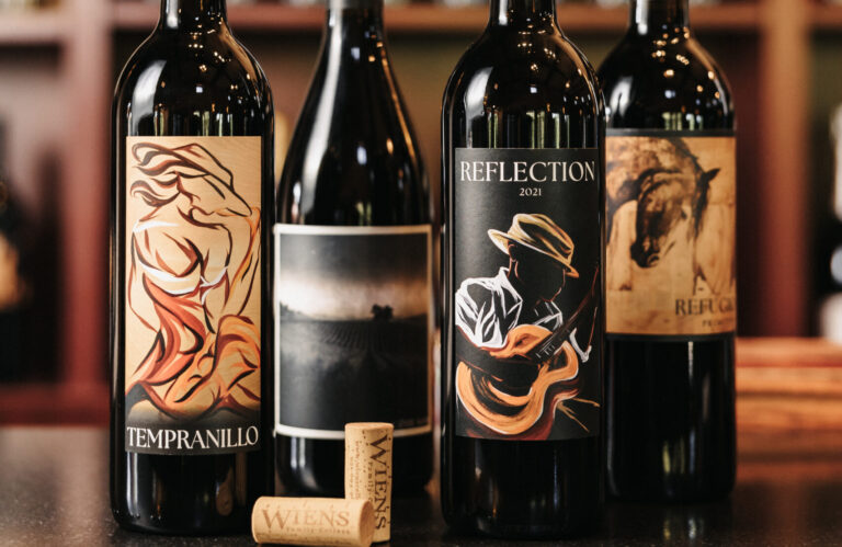
Gone are the days when a wine label was simply about the winery name, grape type, and maybe a vintage year if you’re lucky. Now, it’s all about storytelling, with labels featuring everything from whimsical illustrations to sleek, minimalist designs that could easily hang in an art gallery. This shift isn’t just about looking pretty; it’s a nod to how diverse and expressive the world of wine has become. Whether it’s a label that pays homage to the winery’s heritage with vintage-style art or a bold, abstract design that screams modern chic, there’s a story in every sip, and it starts with what you see on the outside, like with our Artist Series labels.
First Impressions Count: The Power of a Label
Let’s chat about the real MVP of the wine marketing world—the label. Think of a wine label as the wine’s handshake, first date, and job interview all rolled into one. It’s the first thing you engage with, and boy, does it make an impression. A well-designed label doesn’t just shout from the shelf; it whispers secrets about what’s inside the bottle, enticing you to take a closer look.
In a world where we eat (and drink) with our eyes first, a label’s role in branding and marketing is colossal. It tells you the story of the wine: where it comes from, what to expect taste-wise, and even the passion of the people who made it. This visual storyteller helps you navigate the vast sea of wine choices, guiding you to bottles that resonate with your taste and values, whether you’re into the earthy undertones of a classic red or the crisp freshness of a modern white.
And it’s not just about aesthetics. The label can influence the perceived quality and value of the wine, making it a critical player in what makes it into your cart (and onto your dinner table). In a nutshell, a wine label is like the wine’s resume, and we’re all the hiring managers looking for the perfect match.
Bottle Innovations: Shaping the Future of Wine
Not Just Glass Anymore: The Material Revolution
So, have you ever thought about what goes into making a wine bottle? It’s not just about glass anymore. The wine world is getting a serious eco-upgrade with some pretty cool material innovations. We’re talking about lightweight glass that’s easier to ship (hello, carbon footprint reduction!), and even alternative, sustainable packaging that’s as kind to the planet as it is stylish.
Imagine bottles made from recycled materials, plant-based plastics, or even cleverly designed to be reused or repurposed. These aren’t just ideas for the future; they’re happening right now, offering a toast to environmental responsibility. This shift is not only good news for Mother Nature but also opens up a whole new playground for design and functionality. Sleek, modern, and eco-friendly? Sign us up! The wine industry is proving that you can have your wine and drink it too, without compromising on quality or the planet. If you wan to learn more, here’s the latest in sustainable wine packaging.
The Shape of Wine to Come: Beyond the Bottle
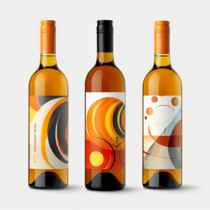
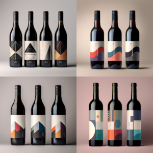
Now, let’s talk about the rebels of the wine world: unique bottle shapes. Gone are the days when wine bottles were one-shape-fits-all. Today, it’s all about standing out and making a statement, with bottle shapes that are as diverse as the wines themselves. From elegantly slender to boldly geometric, these designs are not just a feast for the eyes; they’re changing the way we think about and interact with wine.
But it’s not just for show. Different shapes can influence the aging process, the way we pour, and even the way we perceive the taste of the wine. Plus, they make the wine selection process a lot more fun. Imagine walking down an aisle and finding a bottle that looks like it belongs in a modern art museum. It’s not just a bottle; it’s a conversation starter, a piece of decor, and, of course, a delicious wine waiting to be savored.
These innovations in shape and material are more than just trends; they’re a reflection of the wine industry’s willingness to embrace tradition while boldly stepping into the future. It’s about creating experiences that are memorable, sustainable, and, above all, enjoyable. Click here for an awesome gallery of the most innovative wine bottle designs.
Wine Labels: The Silent Salespeople of the Wine World
The Art of Making a Statement Without Saying a Word
Ever been silently judged by a wine label? Of course, you have! That’s because every wine label is like a mini billboard, designed to catch your eye, whisper (or shout) its story, and convince you that, yes, you do need another bottle of wine. But it’s not just about looking good. A well-crafted label speaks volumes about the wine’s quality and the soul of the winery behind it.
Think of your favorite wine label for a moment. What caught your attention? Was it the elegant font, the quirky illustration, or perhaps the way the colors seemed to pop just right? That’s no accident. Wineries pour their hearts (and marketing strategies) into designing labels that not only stand out on a crowded shelf but also convey the essence of their brand. A rustic, earth-toned label might hint at a winery’s commitment to traditional methods, while a sleek, minimalist design could signal a modern, innovative approach to winemaking.
In a marketplace where every bottle is vying for your affection, a label that tells a compelling story can be the difference between being picked up or passed over. It’s branding, baby, and wine labels do it with style.
The Psychology of Sipping with Your Eyes
Now, let’s get into the nitty-gritty of why we often choose wines based on their labels. It’s not just what’s on the label that counts, but how it makes us feel. The psychology of label design is a fascinating dance of color, imagery, and typography, each playing a part in the ballet of buyer behavior.
Colors, for instance, are powerful mood-setters. A label adorned in deep reds and golds might evoke a sense of luxury and opulence, suggesting a wine that’s rich and complex. Meanwhile, a splash of bright, sunny yellows and greens could communicate freshness and vibrancy, perfect for a light, crisp summer sipper.
And then there’s the imagery and typography. A label featuring an elegant, hand-drawn vineyard scene could appeal to the romantic, nostalgic side of us, promising a wine with history and heritage. On the flip side, modern, abstract designs with bold fonts might attract those looking for something new and edgy.
Every element of a label is meticulously chosen to tap into our desires, aspirations, and even our subconscious, guiding our choices in ways we might not even realize. It’s like each label is whispering, “Psst, pick me, and let’s make some memories.”
Tech Meets Tradition: The Digital Revolution in Label Design
The Magic of Modern Printing
Imagine a world where your wine label could do more than just look pretty. Thanks to the wonders of modern printing technology, that world is here. We’re seeing labels come to life with textures you can feel, colors that shift in the light, and even holographic elements that add a whole new layer of intrigue. It’s like each bottle is dressed to impress, using technology to tell its story in more vivid and tactile ways. These advancements mean designers can be bolder, brighter, and more detailed, making your favorite wine stand out in a sea of sameness.
Labels That Talk to You: AR in Action
But wait, it gets even cooler. With augmented reality (AR) technology, wine labels are no longer just static images; they’re interactive experiences. Imagine pointing your smartphone at a label and watching the winemaker pop up to tell you about the wine, the vineyard, and the winemaking process. Or maybe the label becomes a gateway to a virtual vineyard tour, letting you explore the grounds without leaving your living room. It’s a blend of tradition and technology that brings the story behind the wine right to your fingertips. Here’s a link to an amazing article on how AR is changing the wine game.
Green Bottles: The Eco-Friendly Evolution
Turning Over a New Leaf with Sustainable Materials
The wine industry is getting a green makeover, and we’re not just talking about vineyard practices. The push for eco-friendly materials in bottle design is on the rise, with innovations like biodegradable plant-based plastics and recycled glass leading the charge. These materials not only reduce the environmental footprint of wine packaging but also open up new avenues for creative and sustainable design. It’s a win-win for the planet and for wine lovers looking for more eco-conscious options.
Packaging with a Purpose: Sustainable Practices
Sustainability doesn’t stop at the materials; it extends to the entire packaging process. From reducing water and energy use to minimizing waste, wineries are rethinking how bottles are made, filled, and shipped. This shift towards sustainable packaging resonates with consumers who prioritize environmental responsibility, making it more than just a trend—it’s a movement towards a more sustainable future for wine.
Timeless Treasures: The Charm of Collectible Bottles
The Allure of Limited Editions
For the collectors and connoisseurs, limited edition wine bottles hold a special place in the heart (and the cellar). These bottles are the intersection of art, wine, and exclusivity, often featuring unique designs, rare vintages, or collaborations with artists. They’re not just wines; they’re collectible pieces of history that capture a moment in time, a story, or a milestone, making them coveted treasures for enthusiasts and collectors alike.
Celebrating Moments: Commemorative Bottles
And then there are the commemorative bottles, crafted to mark special occasions, anniversaries, or significant achievements. These bottles are a winery’s way of celebrating with their community, offering a tangible memory of shared milestones. Whether it’s a centennial celebration or a limited run for a historic vintage, these bottles serve as a testament to the winery’s legacy and the enduring allure of wine.
Future Trends in Wine Packaging
As we look to the future, wine packaging is poised to balance tradition with innovation, incorporating new technologies and sustainable practices while respecting the heritage and artistry of winemaking. The challenge for wineries is to innovate within the confines of tradition, ensuring that each bottle of wine offers not just exceptional taste but a memorable experience.
The evolution of wine bottle design and label art is a fascinating journey that mirrors the wine industry’s growth and innovation. At Wiens Family Cellars, we celebrate this blend of tradition and innovation, crafting wines that are as remarkable for their packaging as they are for their quality. We invite you to explore our collection and experience the artistry behind each bottle.
